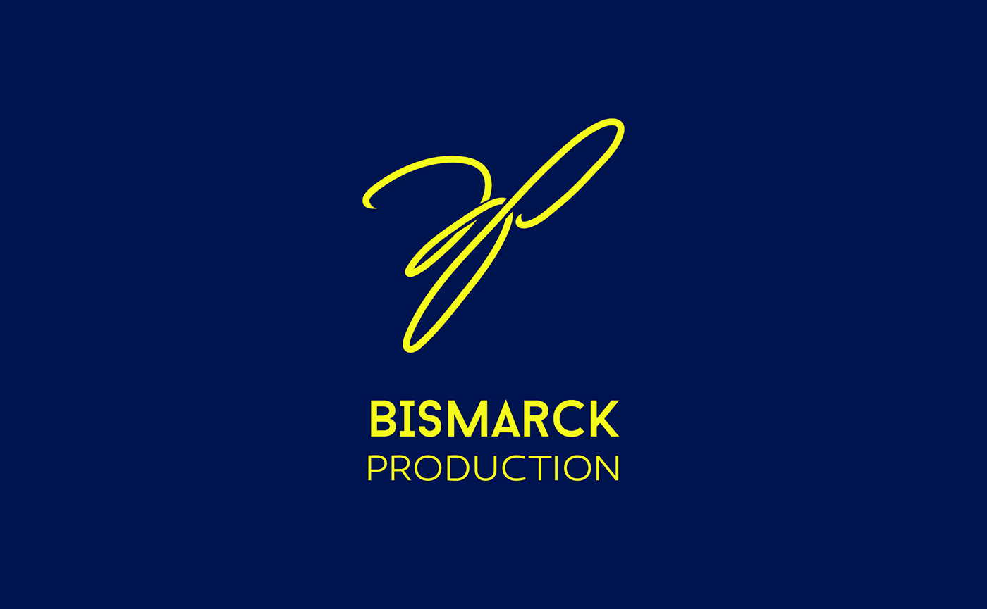
BISMARCK PRODUCTION
This is the logo that i made for my profile and for the main picture of my fiver gigs.
Let me explain a bit why i choose the shape and color for this one,
For the logo itself it means BP (Bismarck Production) but in some kind of tangled line, and yeah i am well aware that you cant read BP very clear from that line very well (maybe some of you can) and that's why i put the name of my production right below it (Bismarck Production) so the viewer can understand what logo they are looking at, and as for the shape i use curved line to make my logo free flowing and not looking stiff from the viewer eyes and i also combined it with some angular lines to generate a sense of innovation to my logo.
As for the color i choose yellow to bring attention to my logo which means to my gigs to make the viewer eyes divert their attention to my logo and i use the blue background to generate and show a sense of professionalism.


